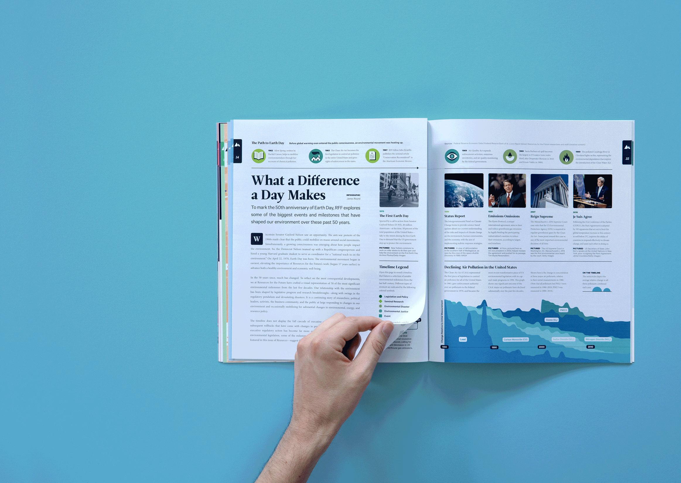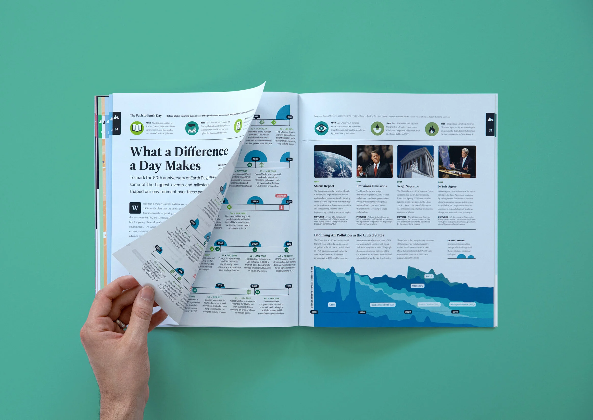
What a Difference a Day Makes
Client
Resources Magazine
A detailed timeline of the biggest environmental moments of the last 50 years.
For their latest issue, Resources Magazine wanted to mark the 50th anniversary of the iconic Earth Day. As part of this they asked me to create a timeline that mapped some of the biggest events and milestones that have shaped our environment over the last half century.
From landmark research to unforgettable environmental disasters, the visualization tracked the environmental highs and lows of the last 50 years. It also included a number of things that lead to the first Earth Day, a single moment that defined each decade, and explored a significant success during that time—the decline of air pollution across the United States. For the latter, I included a graph that showed the decline of a variety of different pollutants, and then also displayed a combined figure for each year on the timeline itself.
Resources Magazine provided a ton of great content which we initially couldn’t fit on a single spread. Rather than cut it down, we decided to use a gatefold in order to provide extra space and create a more engaging and detailed exploration.
In addition to this data visualization, I used the data from this project to create a playful, insightful deck of playing cards that accompanied this issue as a gift for readers. You can see that project here.